
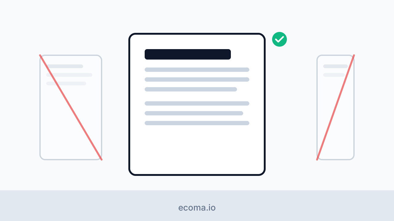
A reading page is not a documentation page
The platform has a documentation surface with a three-column layout: tree, content, table of contents. That layout is right for reference material and wrong for articles. This post is about the differences that matter.
Hierarchy follows attention
Reference readers scan for an entry. Article readers commit to a line. So the article page keeps one narrow column, pushes navigation to the ends of the reading path - previous, next, related - and stays out of the way in between.
Width is a reading decision
A line of prose that runs too wide loses the eye at every return sweep. The article column is capped at a width chosen for prose, not for terminals. Code blocks get their own horizontal scroll instead of stretching the column for every reader because one line was long.
Restraint in the head
| Docs page | Article page |
|---|---|
| Table of contents | none |
| Breadcrumbs | back link to the blog |
| Cross-reference tree | related articles |
Neither list is better. They answer different questions: where am I in the manual? versus what should I read next?
One <main>, labeled navigation
Both surfaces share the public shell, so both inherit the same accessibility
floor: a single <main> landmark, skip link, and every navigation region
carrying a distinct accessible name. Sharing the shell is what makes that
floor free.
The mechanics behind the shared shell are the same ones behind locale switching.